Gardenia
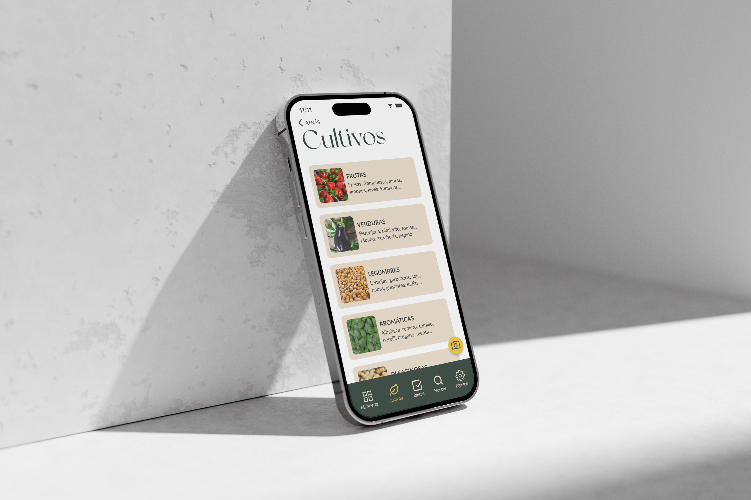
Gardenia is a platform that helps gardeners to manage their vegetable gardens, with a strong focus on excellent user experience.
The Problem
The idea of doing this project came up as a result of having casual talks with urban gardeners. They told me that it was sort of difficult, and sometimes even frustrating, when they had to select a source to consult to find specific information about how to take care of their vegetable garden, especially for beginners, whether they are young people or seniors.
A very relevant fact that was observed at the outset of this project is that many neurodiverse people use gardening as a therapeutic and educational activity. They are mostly mobile users and unfortunately not all apps are designed to be used by everyone. Designing an app that meets the needs of all kinds of people is crucial.
The Solution
A digital platform that meets the needs of all kinds of people is crucial. The most plausible platform would be an app, since its use it easier if the users are on the outside.
Let's see how the project was developed until finding the ideal solution.

The Research Phase
How It Started
This project started with different research methods to find out what was currently available on the market, and what people’s needs are. From this, some conclusions could be drawn with which to start work:
1.- Urban vegetable gardens are more and more popular in cities, encouraging a more sustainable way of life.
2.- As a result of the pandemic, people started to grow their own vegetables, which is a sustainability benefit for both the environment and their personal economy.
3.- At the beginning, they don’t know where they can get certain information from.
4.- Users are very wiling to pay for an app where they can find everything they need.
Surveys & Interviews
In a second phase of research, more than 50 people were surveyed and 8 people were interviewed. These people were between 35 and 70 years old, were gardeners, and were based in different places in Spain and the UK. After analysing their answers, these are the most relevant insights that were extracted:
People who start this activity don’t know where they can find useful and reliable information.
Most of the people who are gardeners are 50 - 70 years old. This is because young people tend to quit soon after starting.
Mobile phones are the way they keep informed.
User Personas
Thanks to the information that has been gathered across the research phase, two User Personas were created that represent the two types of user that have been defined above: young people (35 - 45 years old) who find it difficult to motivate themselves and who are beginners, and more senior people (45 - 65) who are also beginners and feel very lost when looking for information.
Last steps before the hand-over
Once the Design Foundations and the look and feel of the brand had been applied, the Content and SEO teams began optimising and approving the brand’s content ready to be uploaded to the website.
From the initial meeting with the client to the website launch took 6 months. During this time, the team and I performed QA and UAT to ensure that the website performed optimally.
Card Sorting
Having these two user profiles and after defining their motivations, needs, and pain points, two scenarios and two User Journeys for each of them were created. These techniques allow us to understand in detail how the user interacts with the product to meet the goals set in the scenarios, and to define what the essential requirements are to start shaping the digital platform.
To get the Content Tree, Card Sorting was used. Afterwards, the results were validated via flow charts, which were created based on the scenarios from the previous phase.

Shaping The App
To get the Content Tree, Card Sorting was used. Afterwards, the results were validated via flow charts, which were created based on the scenarios from the previous phase.
User testing
To create the visual layer to be applied to the Hi-Fi Wireframes, it was designed with Nielsen’s Heuristics in mind, as they’re essential to ensure an accessible, usable, and functional digital platform.
To ensure that this app is easy to use, it was evaluated in two different ways: on one hand, through a Heuristic Evaluation from which it was deduced that despite mostly complying with the heuristic rules, there were still some aspects that needed to be corrected. On the other hand, user tests were carried out. They were very revealing, as they helped to confirm that the app met their needs, as well as being intuitive and functional. Obviously, there were points of improvement that were applied later as well.
Conclusions
There is no a specific user profile, and one of the most relevant findings is that among all the people who like gardening, there are a lot of neurodiverse people, so it’s key to design an app that meets their needs as well.
If you are feeling curious go ahead and see some more:
you can have a quick look at this short spot and to this introductory video in Spanish where I explain in detail how I created this stunning app
Want to See More?


