White Label for Beam Suntory
Building a Unified Design System
Overview
Beam Suntory is a globally recognised distillery known for its premium spirits such as whisky, tequila, vodka, cognac, rum, and pre-mixed cocktails.
Laphroaig, Courvoisier, Larios, Jim Beam, Maker’s Mark, Roku, Sipsmith, and Bowmore are just a few examples of brands from their extensive portfolio.
The Challenge
Creating Unity in Diversity
Until 2021, each brand in Beam Suntory’s portfolio had its own website with unique layouts and designs. While this allowed each brand to maintain its individuality, the company wanted a more cohesive experience. The goal was to ensure that users visiting any of these brand websites would feel a unified Beam Suntory identity without compromising each brand’s distinctive personality.
The Solution
A Modular Design System
To achieve this, Beam Suntory needed a design system that could be applied across all its brands, regardless of complexity. Our task was to create a system that allowed the brands to express their uniqueness while maintaining structural consistency with Beam’s core essence. We adopted an atomic design methodology, which helped us break down each design element and rebuild it into a scalable, reusable system.
Building the White Label Design System
The System
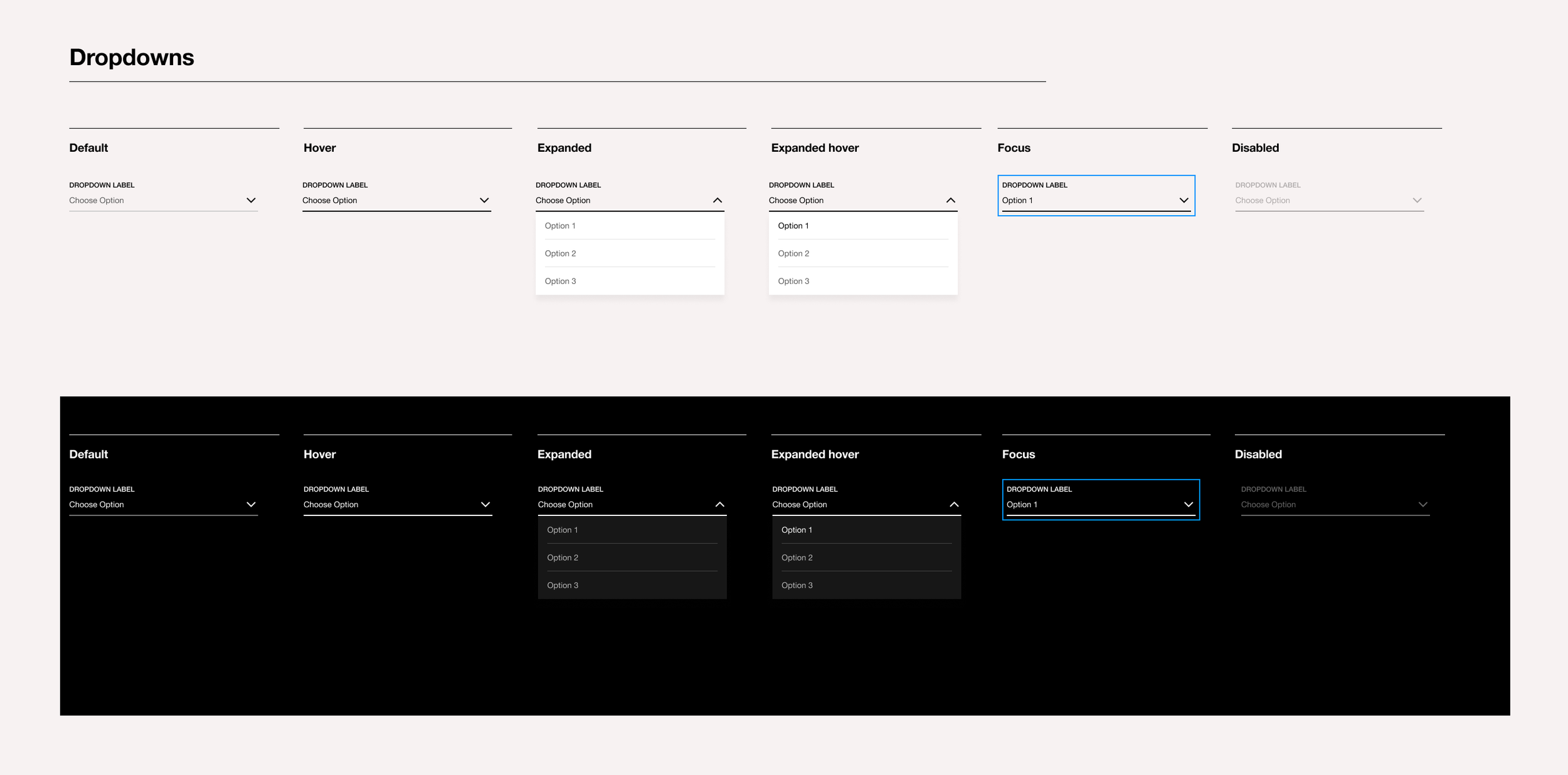
The result was the White Label, a modular design system based on atomic design principles. This approach enabled us to continuously refine and improve components, offering flexibility and consistency in both design and implementation. Collaboration was key—we worked closely with development teams and product owners to ensure the system was both visually impactful and technically feasible.

Laying the Foundations: Learning from Early Mistakes
How It All Started…
When we began building the design system in 2020, we were still getting familiar with Figma and the concept of component-based design. Initially, we manually built every element—buttons, dropdowns, input fields, colours, shadows—separately for each viewport. It was an overwhelming process! But as we evolved, we discovered more efficient techniques like Figma’s Auto Layout, which dramatically simplified our workflow and helped us align components more effectively.
Foundations in Place
Over time, we learned to organise our components more efficiently, document them better, and establish clearer communication practices within the design team. This turned our chaotic initial setup into a structured, scalable design system that was far more sustainable.
Methodology: Identifying Problems and Creating Solutions
Discovering the Gaps
We started by analysing the existing brand websites. While they displayed similar content, the layouts, grids, and iconography were inconsistent, leading to confusion among users. Conversations with brand managers revealed that despite attracting over 20K visitors, a large percentage dropped off before completing checkout. This was a significant issue for Beam Suntory.
Defining a Unified Visual Identity
Our solution was to streamline the visual identity. We redesigned the iconography, simplified the colour palette, and reduced the typefaces to just two per brand. This approach ensured consistency while still allowing room for individuality in each brand’s expression. By creating interchangeable elements, we made it easy for brands to adapt these guidelines when redesigning their sites.

Testing the Design System: Cruzan’s Redesign
The first real test for the White Label came during the redesign of Cruzan. During the process, we encountered some accessibility challenges, but thanks to the structured system we had in place, we quickly resolved them. After a second round of testing and collaboration with the development team, the White Label functioned smoothly, proving its value in real-world applications.
Scaling the System: The Power of Design Tokens
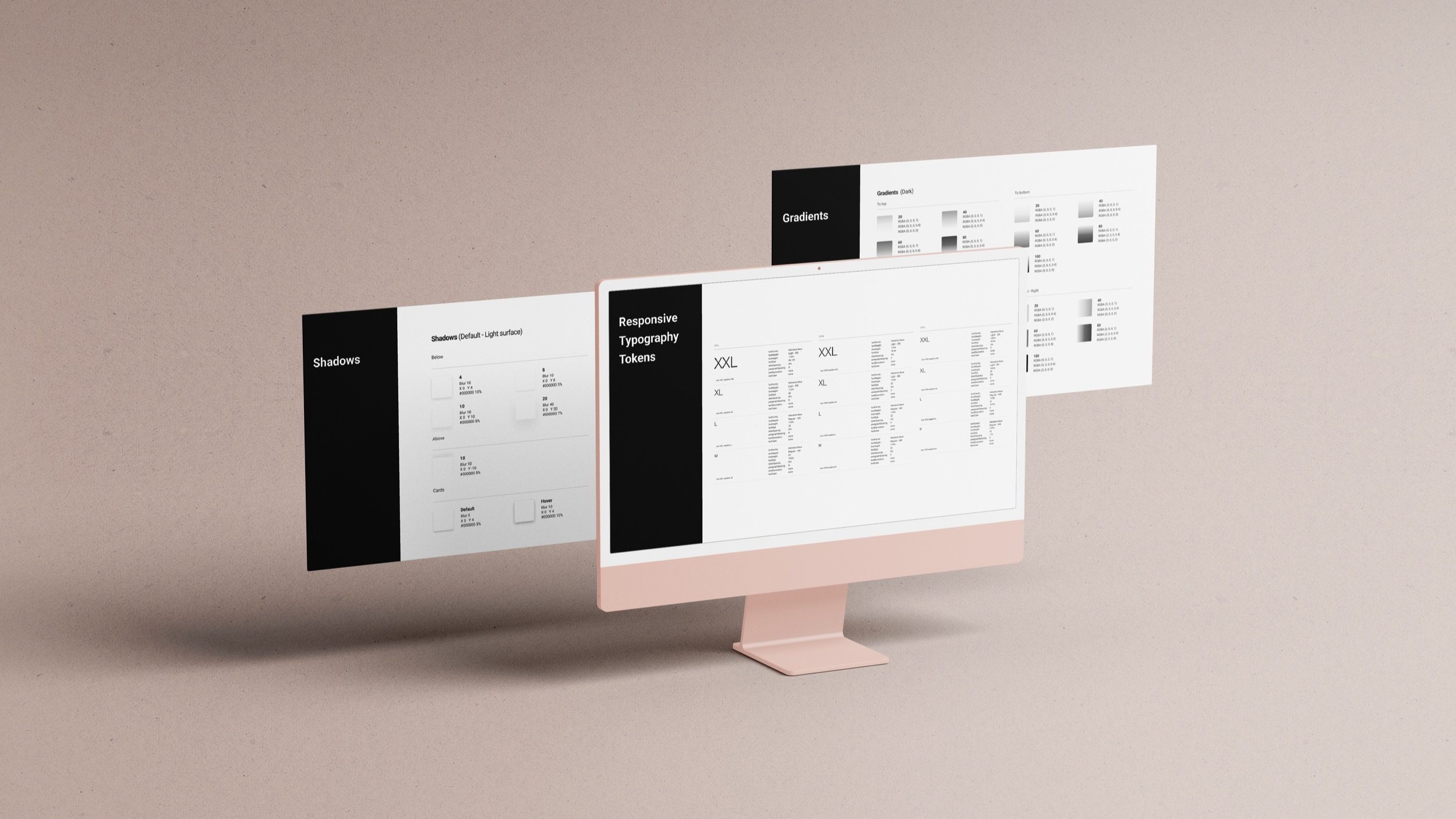
In 2022, we implemented design tokens to meet the growing demand for redesigns. This decision allowed us to automate parts of the process, maintain consistency, and accelerate delivery times by providing JSON files for each brand theme. The benefits included:
Automation: Reduced repetitive tasks, streamlining the design process.
Consistency: Maintained uniform visual identity across all brands.
Faster Delivery: Enabled quicker iterations.
Improved Documentation: Made it easier for teams to implement the system.
Shortened Learning Curve: New team members could get up to speed more quickly.

A Header of the White Label Design System showing its structure in different viewports
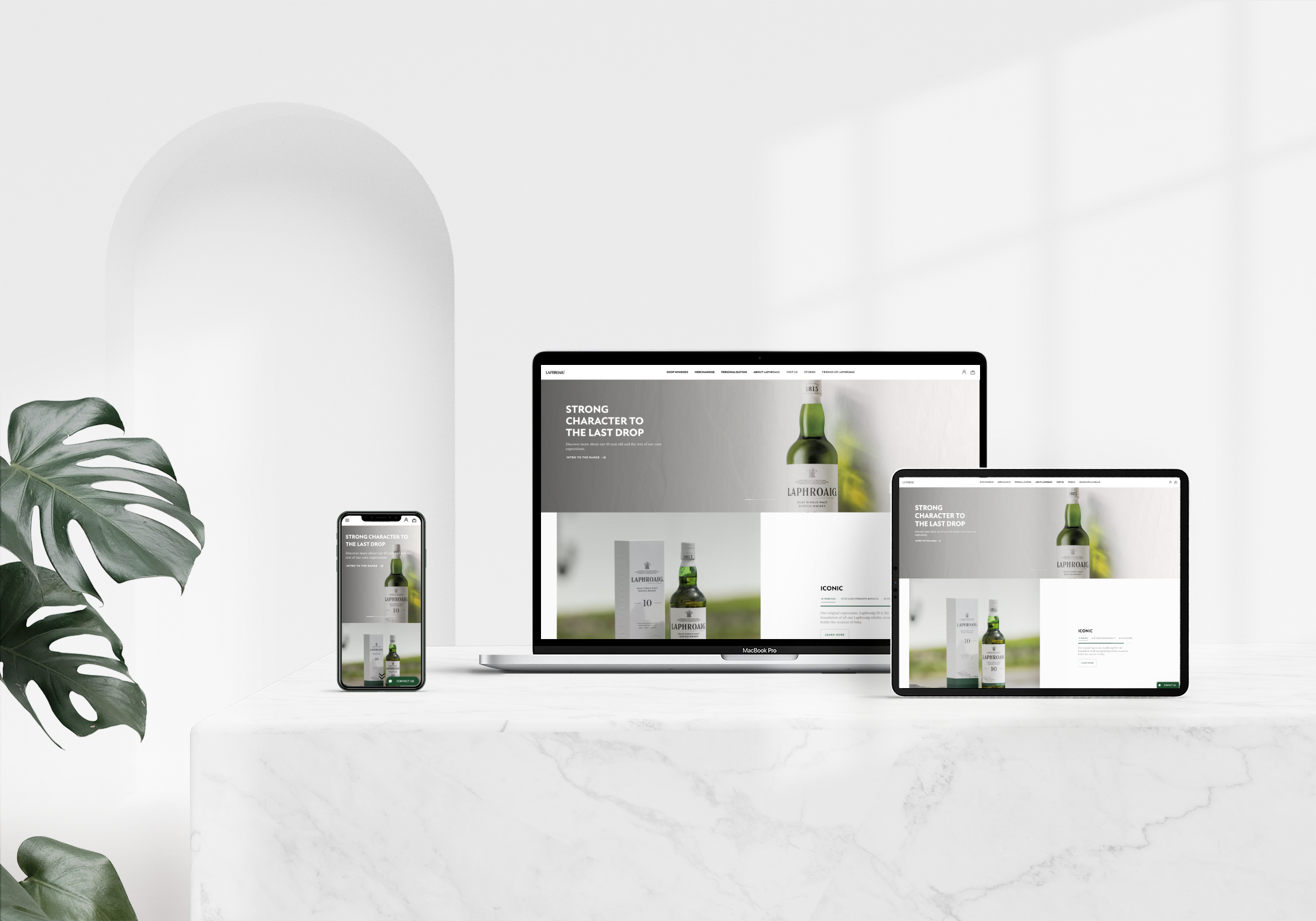
After having created a Design System, all brands are using the same layout with their own look & feel
Detail of flow of the token design system
The Importance of Documentation
Documentation: The Backbone of a Good System
To maintain the quality and longevity of our design system, we used Confluence to document every aspect. This included design specs, use cases, component behaviour, and links to Figma files, ensuring that both the design and development teams had a reliable source of truth.

Conclusion: The Benefits of a Well-Structured Design System
Creating a design system requires dedication, collaboration, and continuous iteration. The key benefits we gained from the White Label included:
• A single source of truth for components and patterns.
• The ability to focus on complex design problems rather than tweaking aesthetics.
• Increased consistency and faster replication across brands.
• Reduced miscommunication between teams.
One of the most notable successes was the redesign of Laphroaig, which saw a 120% increase in sales within the first month after launch. A design system is a living entity—it must evolve with the products it supports. However, having a strong foundation is crucial for maintaining quality and ensuring adaptability over time.
Want to See More?


