Laphroaig for Beam Suntory
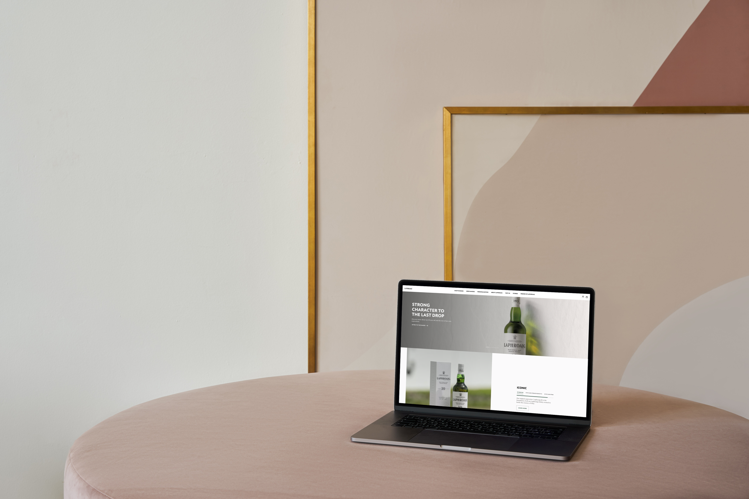
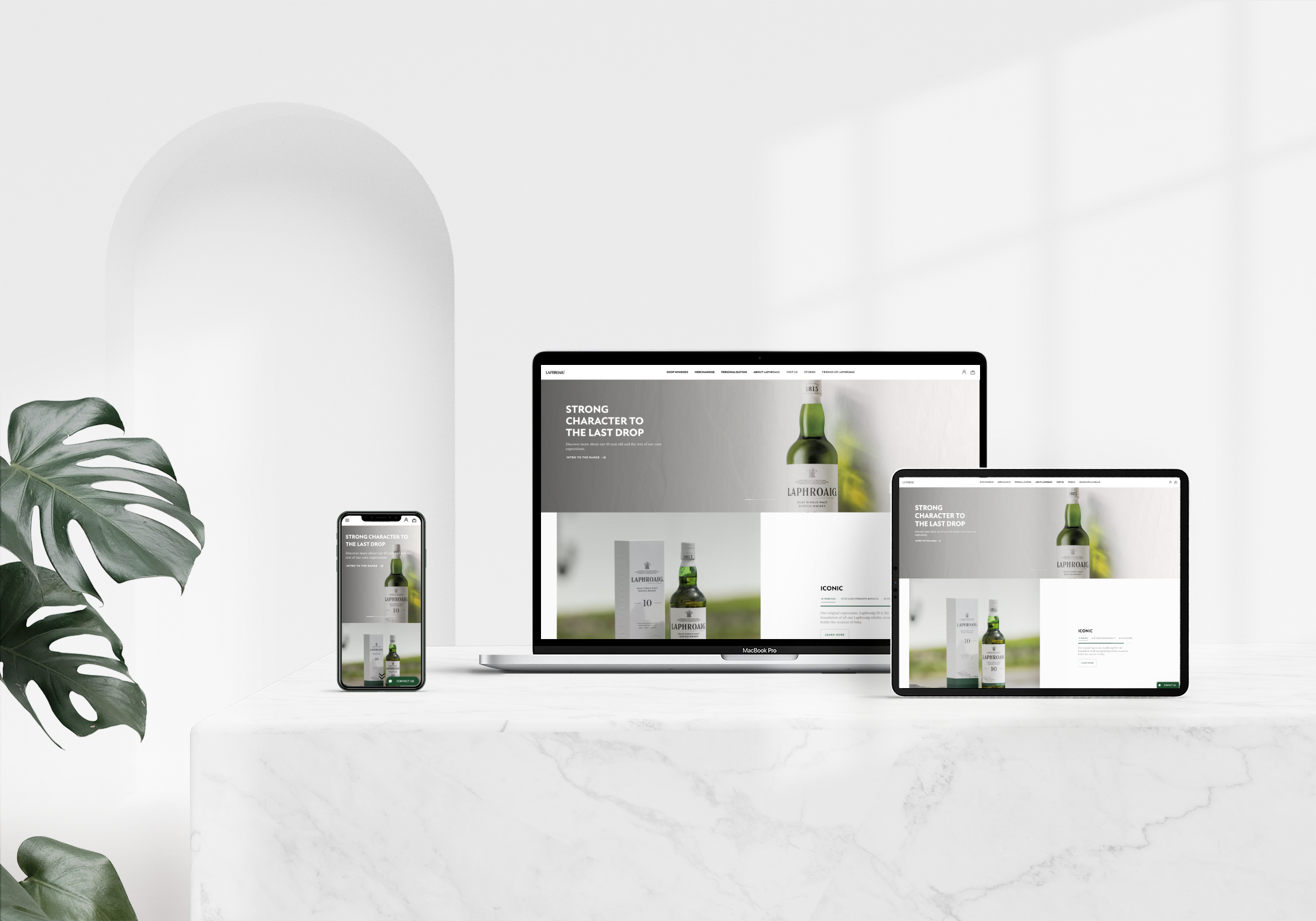
I had the privilege of leading the design team during the complete redesign of Laphroaig’s website. Our primary goal was to deliver an end-to-end transformation, with a strong focus on user experience and accessibility. The client envisioned a space where users could truly connect with the brand, capturing its essence and core values while inviting them into the rich world of Laphroaig.
What’s Laphroaig?
Laphroaig is not just a luxury Scottish whisky brand; it’s a legend in the world of spirits, renowned for its rich heritage and distinctive peaty flavour. As part of the prestigious Beam Suntory group, Laphroaig enjoys a loyal following, attracting over 15,000 monthly web visits from whisky enthusiasts eager to explore what this iconic distillery has to offer. However, despite this impressive traffic, only 23.8% of visitors were completing the checkout process. The culprit? A confusing and poorly organised website that hindered user experience and made it challenging for customers to enjoy the journey of purchasing their favourite whisky.
The Main Goal
The primary aim was to relaunch the Laphroaig website with a fresh, modern aesthetic that embodies the values of its parent company, Beam Suntory. To achieve this, the brand book’s guidelines were transformed into design foundations, seamlessly integrated into the White Label, Beam Suntory’s modular design system. In this collaborative effort, I oversaw the design team while working closely with the Content, SEO, and Development teams to ensure a cohesive and engaging online experience.
The Design System
The Foundations
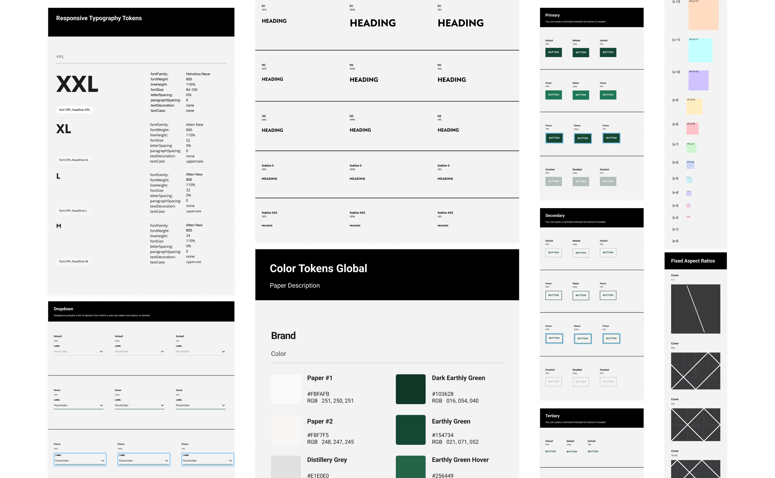
We established the design foundations by meticulously following the brand book guidelines. After applying all the essential assets, such as the colour palette and fonts, we conducted our first accessibility check to ensure an inclusive experience for all users.
The Token System
Initially, we built various modules and templates manually—classic beginner mistakes like copy and paste. This approach was not only incredibly tedious, but it also led to frustrations when elements didn’t align properly and required constant tweaking. Then we discovered autolayout, and it was like magic! This discovery transformed our workflow, making the design process significantly smoother and more efficient.
The Modular Design System
The final step involves transferring all design foundations into the modular system. During this phase, we perform another thorough check to ensure that every element complies with ADA standards and meets the specific guidelines set by the client.


Final Steps Before the Hand-Over
With the Design Foundations and the brand’s aesthetic successfully applied, the Content and SEO teams began the crucial task of optimising and approving the brand’s content, preparing it for upload to the website.
The journey from our initial meeting with the client to the exciting launch of the website spanned six months. During this time, my team and I conducted thorough QA and UAT to ensure the website delivered optimal performance and an exceptional user experience.
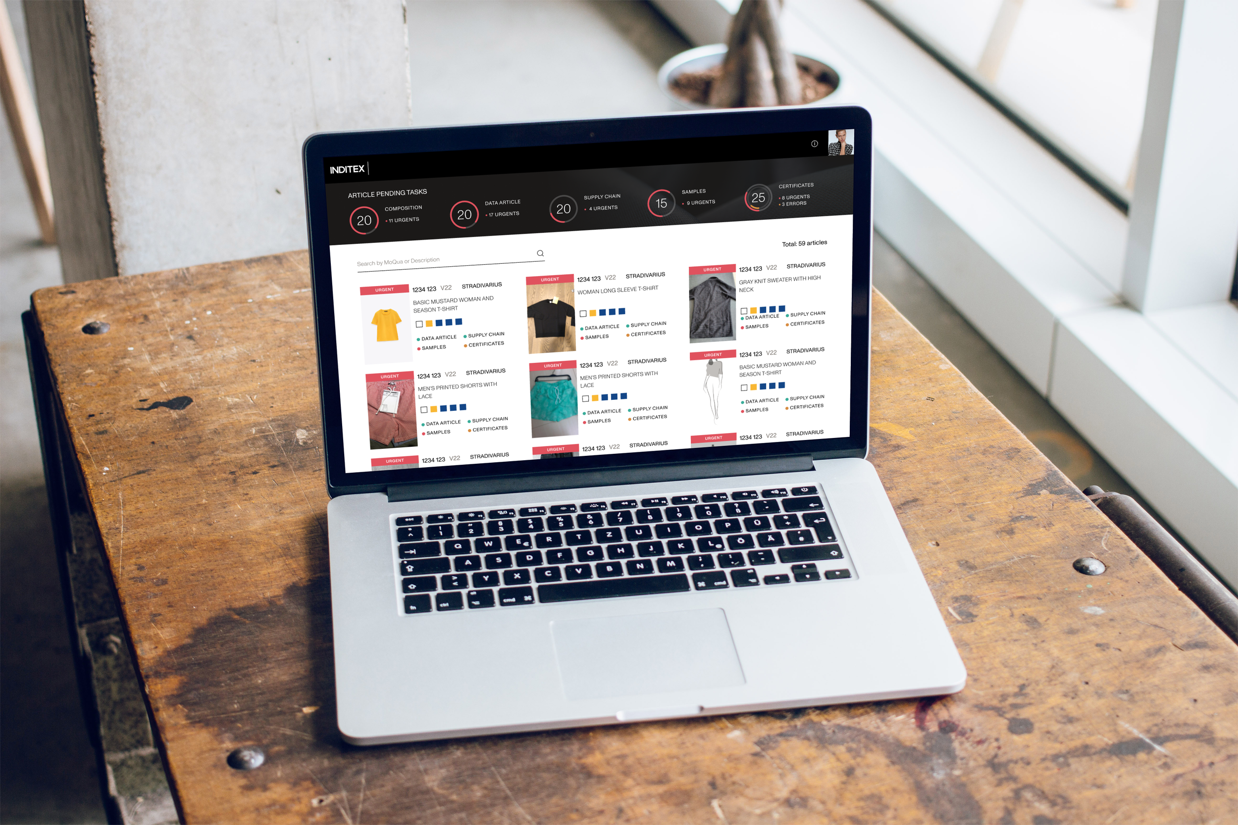
Here you can see some other examples that followed the same process
Want to See More?


